I recently read a Substack article, offering thoughts and data about the dulling of color, in products and images, over time and worldwide. It points to influences such as Minimalism and the economic pressures of mass markets to account for things such as monochrome movie palettes and the current rainbow of silver, white and black cars. But I think there is another important factor: bright colors have come to be associated with plastic toys, cereal boxes and the covers of tabloids: cheap things. To be classy, best tone it down a notch.
For the final installment of Amy Worth Week, celebrating the memory of my multi-talented artist sister, let’s start by taking a look at this guy:

This is Kaffe (rhymes with “safe”) Fassett, a British-American textile artist, painter and designer who has no fear of hue and saturation, and obviously did not get the message about how to keep things classy. Here are some of his textile designs:


I became aware of Fassett from an art book on Amy’s shelf, Kaffe Fassett’s Glorious Interiors, which is filled with collections of things that shouldn’t go together, but do. I found the images compelling, surprisingly beautiful, bringing to mind bower birds and Gee’s Bend Quilters:

These artists have a bold and improvisational color and pattern sense - one might even call it cheeky. Similar in spirit to Kawaii street style in Tokyo, Sapeurs in Bacongo and hillside houses in Guyaquil.


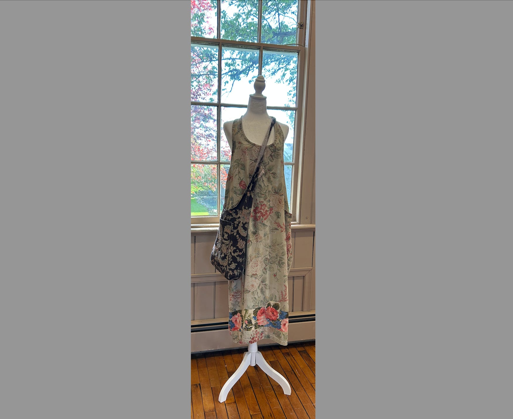
I am drawn to such eye candy, but I confess to being one of the contemporary color dullards, gravitating to a hue that can only generously be called “clay”. My wardrobe consists of five pieces of athleisure compression wear, purchased in multiples in a narrow range of “colors”. Sometimes I will wear a bright pair of pants, but if I attempt anything more complicated I end up feeling (maybe even looking) like this:

To get a bright, varied patchwork of colors to look good, you have to know a thing or two about color. That is probably why the majority of people don’t veer too far outside of the greyscale for their clothing, cars and interior decor. Amy, on the other hand, was good at color and used it with confidence. This confidence was built upon years of study, practice and careful observation. Here is a sampling of her work in various mediums:


If you would like to incorporate more color in your repertoire, here are some hints that I picked up from Amy over the years:
gaudy and colorful can look great when it is composed of high quality, fancy, expensive stuff (and you can typically get it used)
some examples of this: Oilily, Marimekko, Kaffe Fassett, Liberty fabrics
if you want some inspiration, wander the aisles of Mood Fabrics in New York’s garment district (her happy place)
vintage is often better
if you are an artist, and you want to get better at color and value (darks and lights), Peggy Kroll Roberts is a great teacher
for your home, out of print but available on ebay: Motif wallpaper
Most importantly, Amy - a lifelong student and lifelong teacher - would encourage you to just work with it. Try it out, try it on, put it together. You’re bound to come up with something good sooner or later.